Guardian
Problem.
If there’s one name you would want to own as a protection provider, it would be ‘Guardian.’ That’s why new insurer, Gryphon Group Holdings, purchased this legacy brand with the intention of bringing it back to life. It was the perfect vehicle to help them challenge the industry status quo.
The problem was how to reinterpret the brand for a new era. The new iteration had to reflect the company’s commitment to re-inventing life insurance for the better, whilst at the same time respect the proud heritage.
Solved.
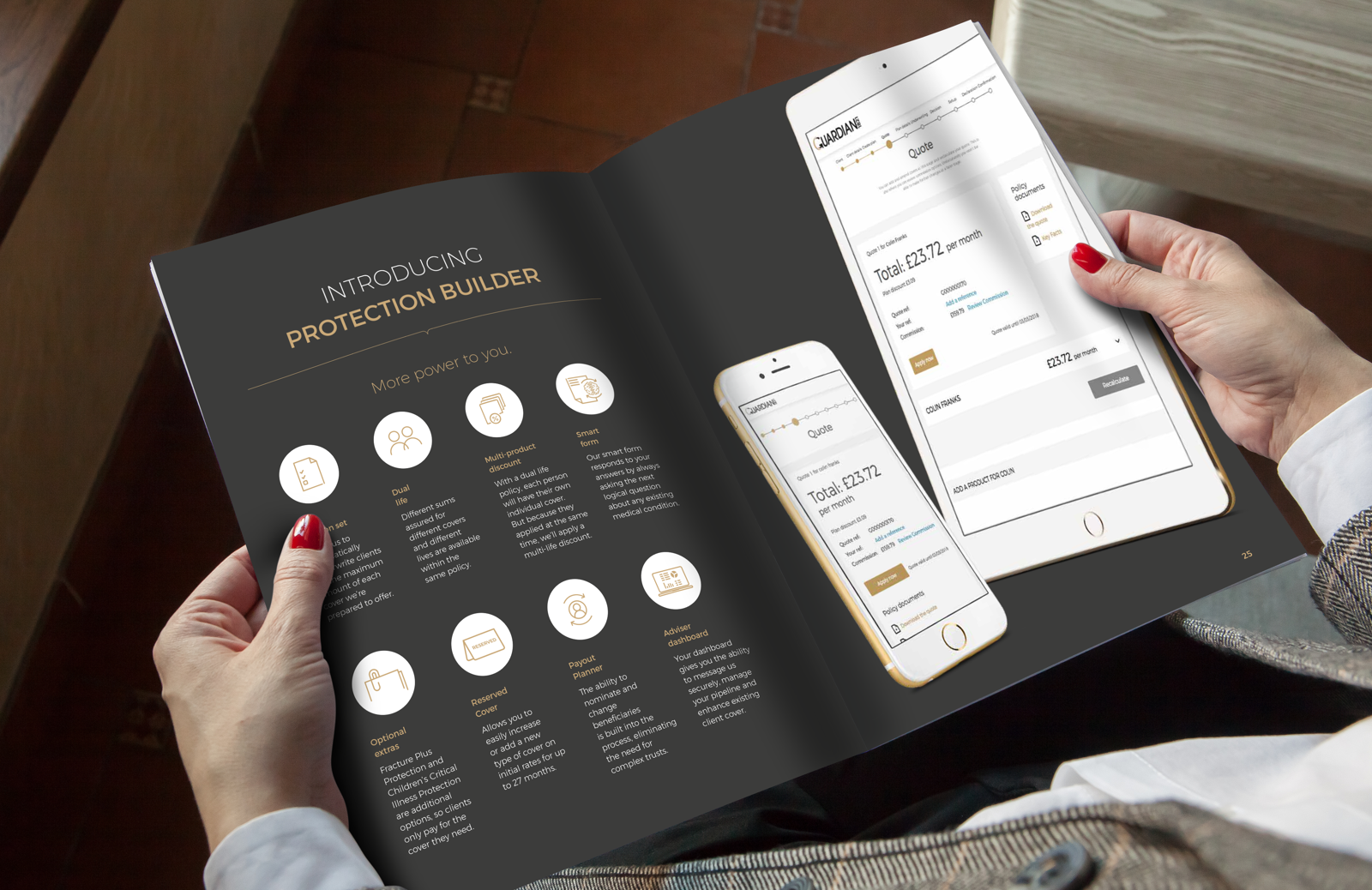
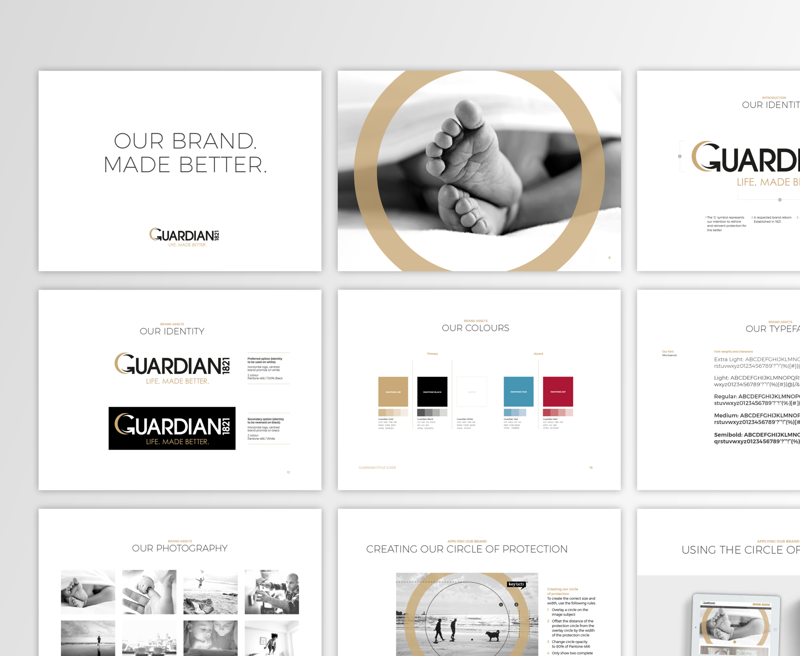
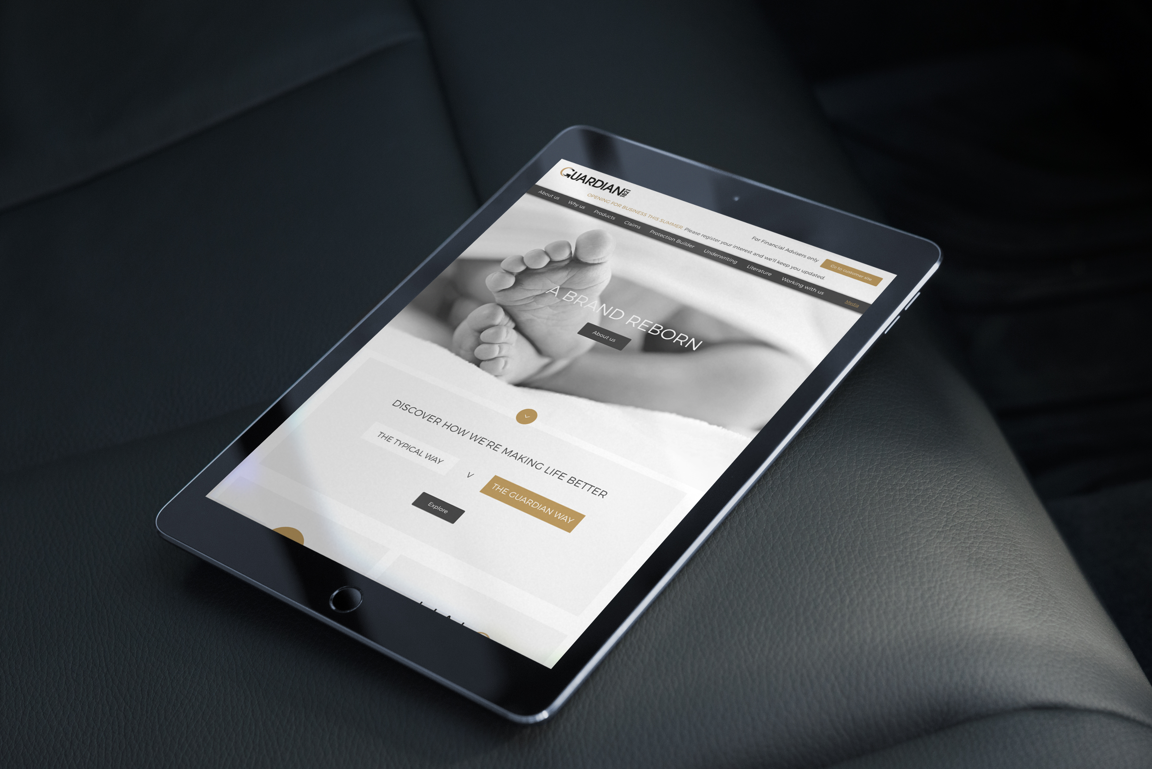
The Guardian ‘G’ became the symbol of re-invention, and the original colours of black and gold were reintroduced. The date 1821 takes its place as part of the identity, reaffirming the brand heritage and everything is underpinned by a clear promise of ‘Life. Made Better’.
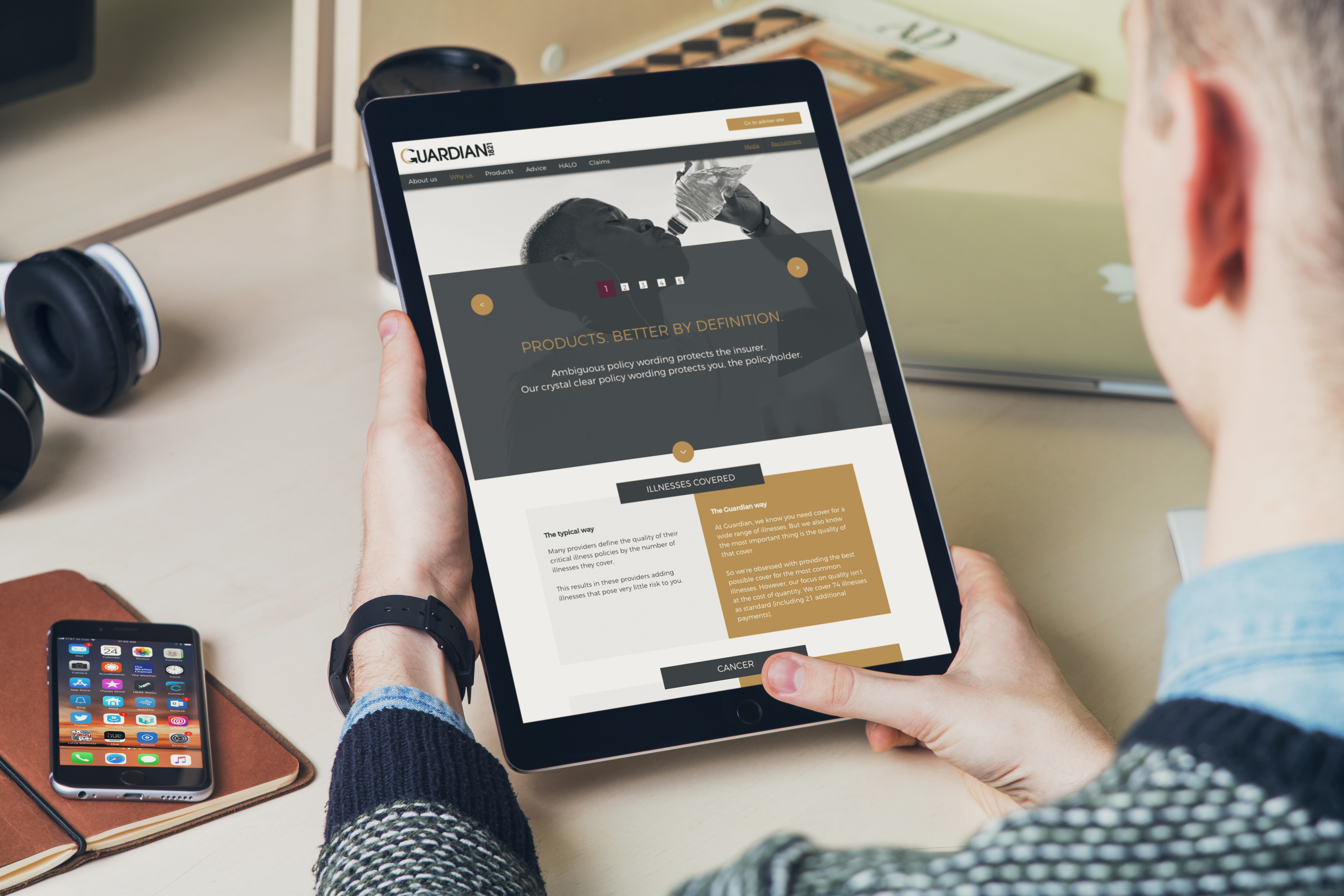
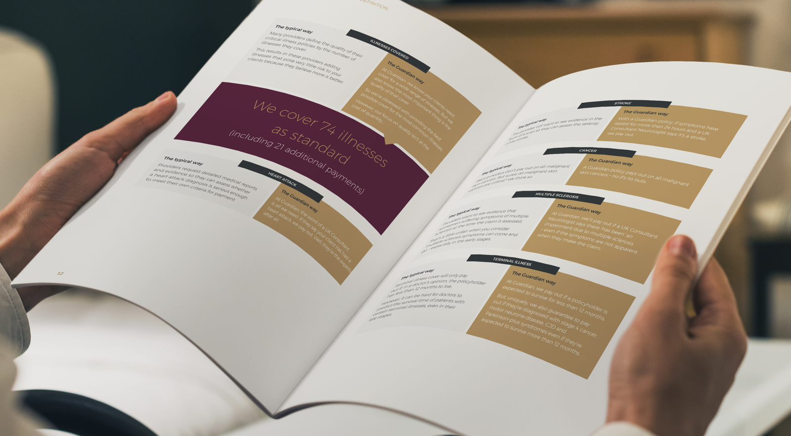
Black and white photography lets the brand project quality, while the messaging strategy amplifies every point of difference by comparing the ‘Typical Way’ insurers do business with the ‘Guardian Way’ of doing business.